
News
From our latest research publications to insightful, thought-provoking blogs, keep informed and engaged with the latest updates from UBDC.
.svg)
.svg)
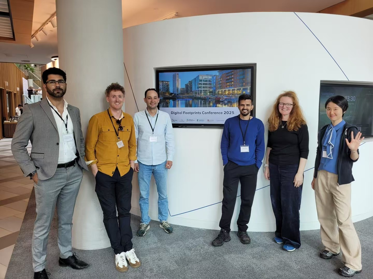
UBDC attends the 3rd Digital Footprints Conference in Leeds
This year focused on Digital Footprints for the Public Good exploring the exciting potential of novel data sources to drive impactful research.
UBDC attends the 3rd Digital Footprints Conference in Leeds
This year focused on Digital Footprints for the Public Good exploring the exciting potential of novel data sources to drive impactful research.

UBDC support for Brazil's 'Map of the Peripheries'
The Urban Big Data Centre is joining a new partnership with Brazil’s Secretaria Nacional de Periferias, and the Humanitarian Open Street Map Team aimed at supporting the Map of the Peripheries project.
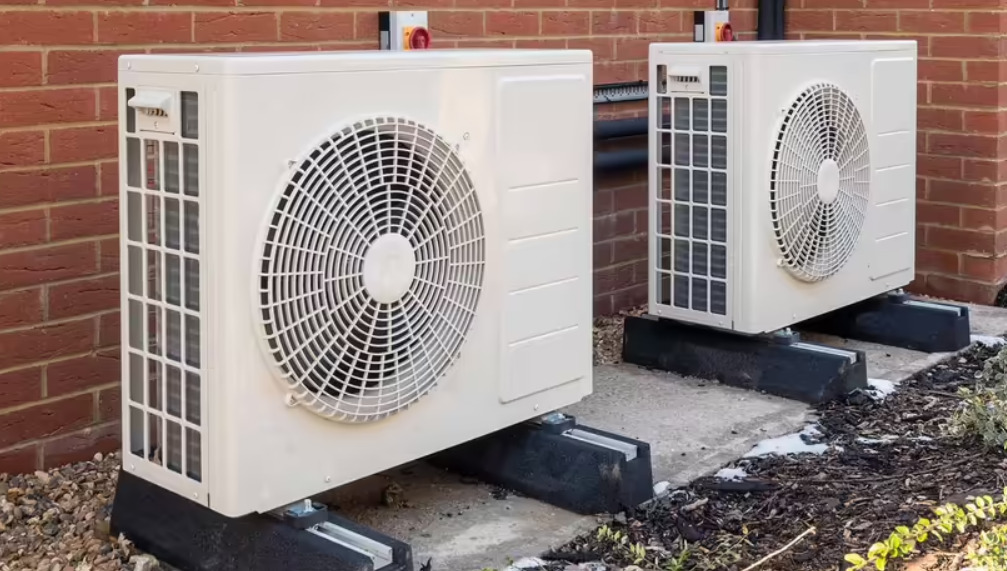
How many heat pumps?
UBDC Director Nick Bailey responds to The Climate Change Committee downgrading the estimate of progress with the installation of heat pumps.
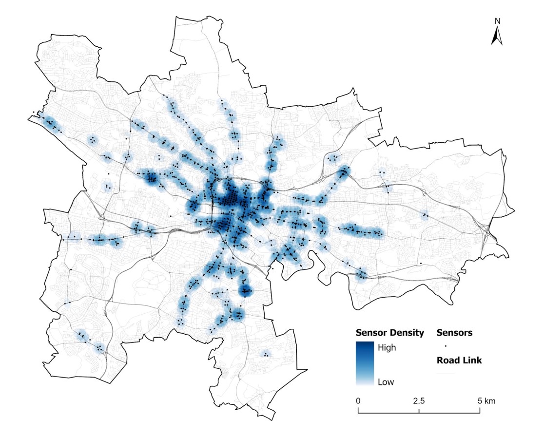
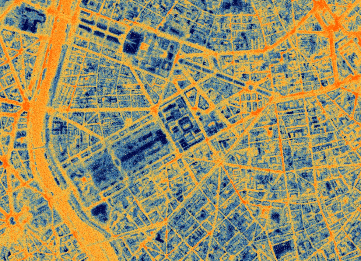
Glasgow’s new hi-res traffic dataset sheds light on city traffic patterns
UBDC researchers have cleaned and processed raw traffic flow data from Glasgow City Council's open API portal to create a new analysis-ready dataset.
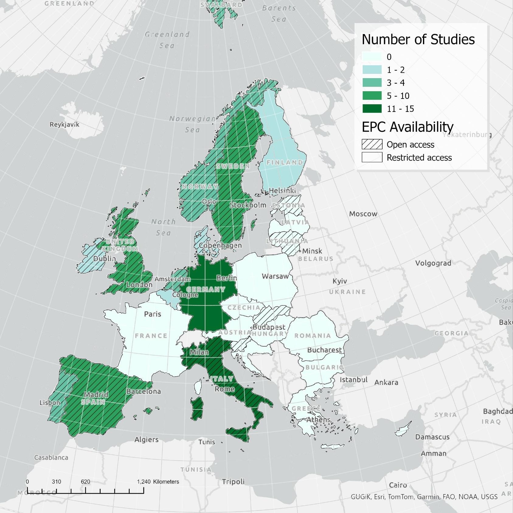
How investing in energy efficient homes pays back – twice!
New review on the impact of energy efficiency shows that more efficient properties are cheaper to run and worth more to sell.
European Space Agency funding UBDC and SatVu to develop Heat Loss Index
The European Space Agency (ESA) is funding a feasibility study, led by SatVu in collaboration with the University of Glasgow, to enhance the analysis of building energy efficiency.
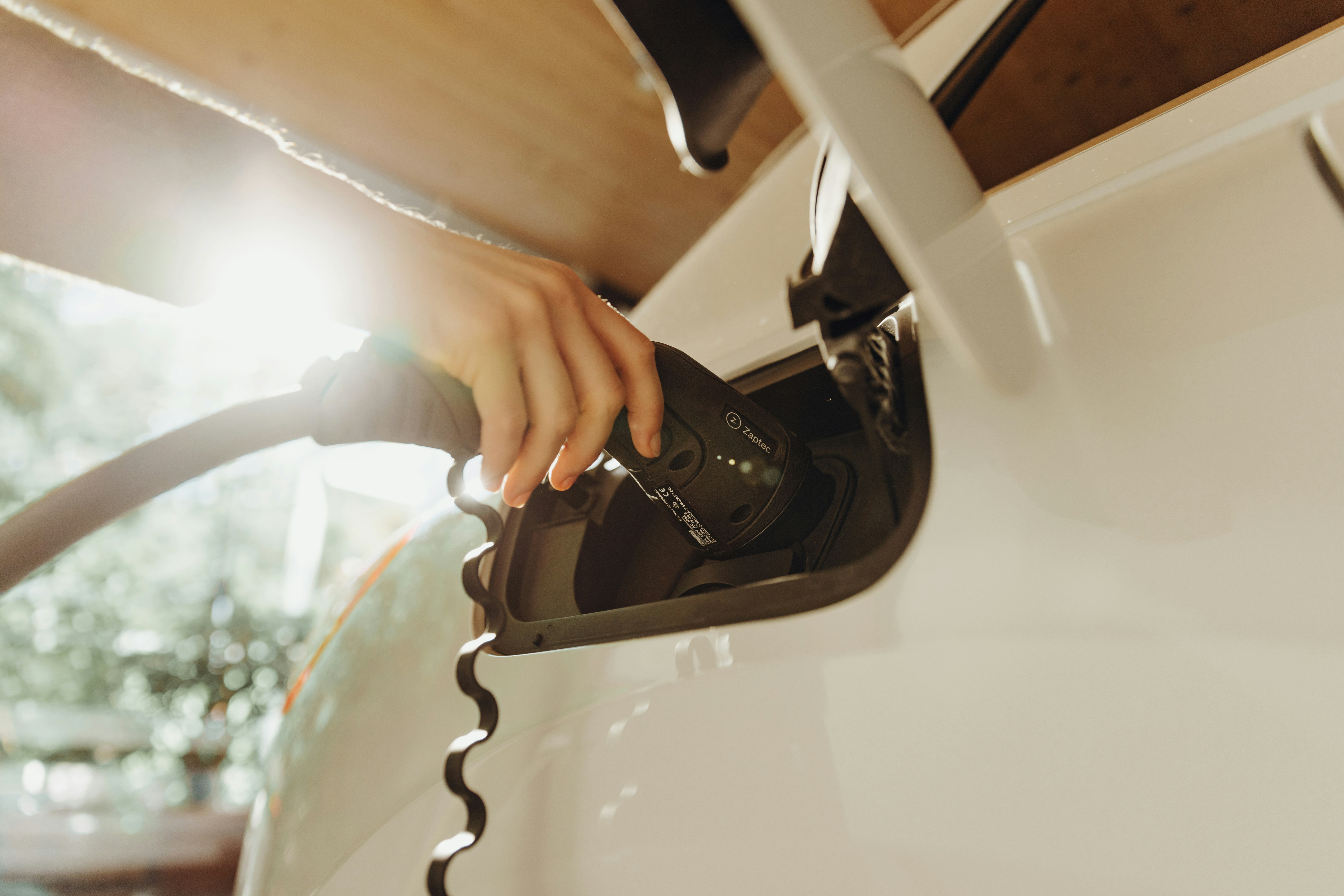
UBDC team wins a top award at the ACM SIGSPATIAL conference
Researchers examined the 'Optimal Minimum Deployment of Electric Vehicle Charging Station Networks'.
IDEAMAPS network launches new platform
The IDEAMAPS Network launches its Data Ecosystem platform - a new digital mapping tool to support improvements in deprived areas in Low- and Middle-Income countries.
Indoor environment and energy use study
UBDC - in collaboration with Understanding Society, the UK Household Longitudinal Study - is launching a new study to provide linked-data on energy usage and indoor environment.
.svg)
Join the Hub
Access the latest updates from UBDC and the university's wider social science community at the Glasgow Social Sciences Hub.
Jointly funded by


