
News
From our latest research publications to insightful, thought-provoking blogs, keep informed and engaged with the latest updates from UBDC.
.svg)
.svg)
UofG social scientists receive UKRI funding for data-driven research
UofG social scientists receive UKRI funding for data-driven research
UofG social scientists have received UKRI funding that will enable them to conduct data-driven research aimed at improving lives across Scotland and the UK
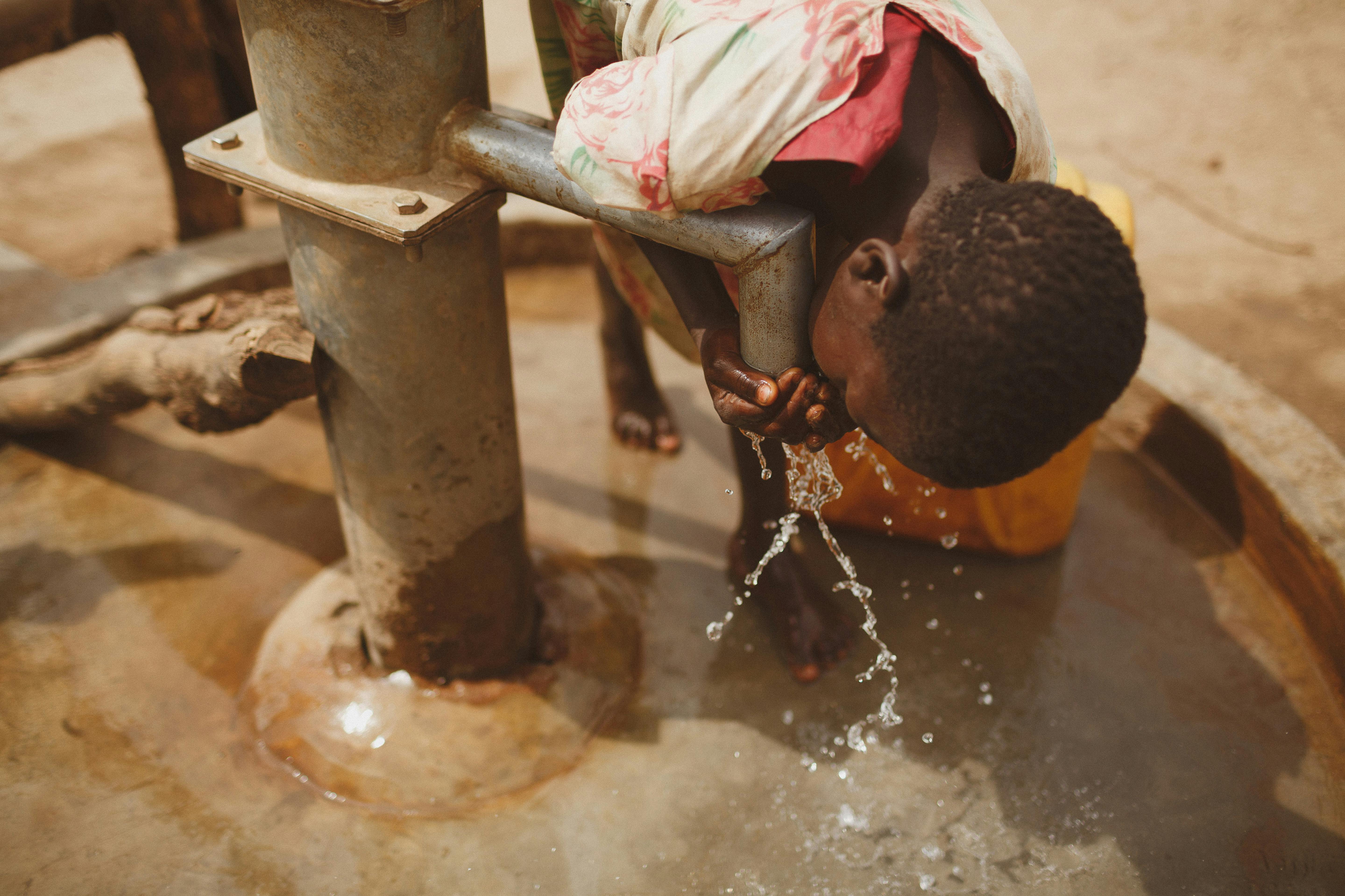
Turning Geospatial Data into Planning Decisions: Evaluating a Participatory Accessibility Model for Urban Drinking Water
Urban planning increasingly uses geospatial data and spatial models to map services, estimate travel time, and identify underserved populations. However, mapped proximity does not necessarily reflect real access. In rapidly urbanising Sub-Saharan African cities, true accessibility to services such as water depends not only on location, but also on functionality, quality, affordability, waiting time, and seasonal reliability. UBDC's Oluwatimilehin Adenike Shonowo has been conducting research into these multidimensional access challenges.
UBDC social scientist receives smart data research fellowship
Two social scientists at the University of Glasgow have been awarded Fellowships by Smart Data Research UK (SDR UK).
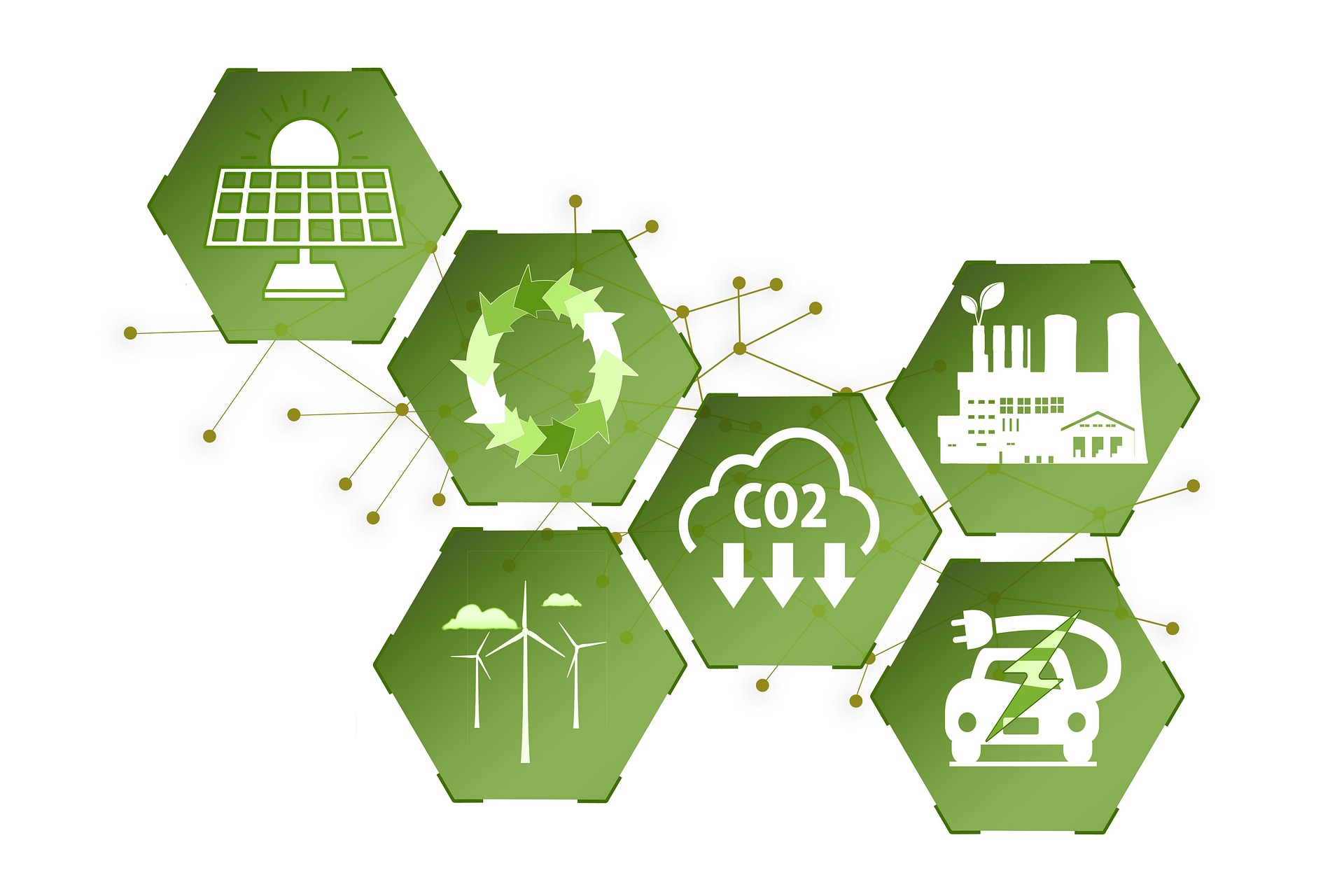
New energy efficiency framework to address global net-zero carbon agenda
A new way of classifying energy efficiency that could benefit households and address the global net-zero carbon agenda has been developed by the Universities of Glasgow and Cambridge.

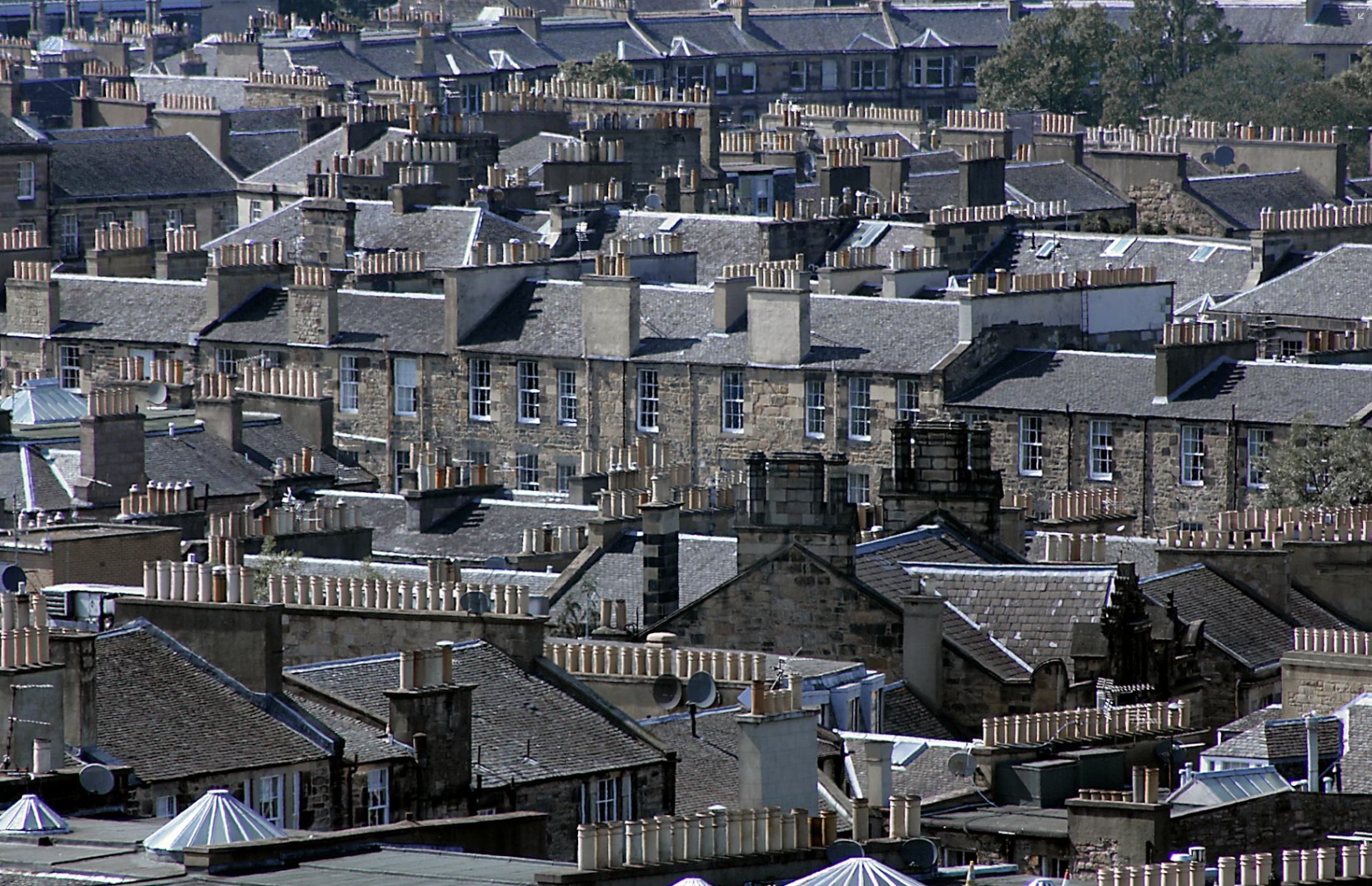
The slow demise of the sustainable city?
With commuting frequencies falling as hybrid working becomes the norm for many, are people still prepared to pay a premium for houses with better public transport services? If not, what does this say about the future shape of our cities? A recent paper by Dr. Michail Georgiou, Professor Nick Bailey and Dr. Jose Rafael Verduzco-Torres at UBDC address this key question.
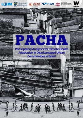
UBDC research to reduce climate change impacts on health and wellbeing in Brazil’s favelas
Research led by the UBDC is aiming to reduce climate change impacts on health and wellbeing in the country’s favela urban communities.
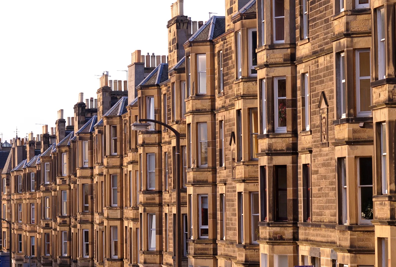
How online real estate agencies are changing the housing market
A team of researchers have used Zoopla Property data from the UBDC data service to analyse how online real estate agencies are affecting the UK housing market. In this blog, Cigdem Gedikli (Swansea University, UK), Robert Hill (University of Graz) Oleksandr Talavera (University of Birmingham), Okan Yilmaz (Swansea University) outline the findings from their paper.
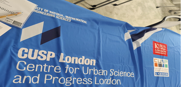
UBDC Data Dive
In February 2025, I had the incredible opportunity to attend the Data Dive program hosted at King’s College London, led by the Centre for Urban Science & Progress (CUSP). Each year students from London, Glasgow, Warwick, New York, and Peking come together for a 4-day hackathon to use data to address important urban challenges.
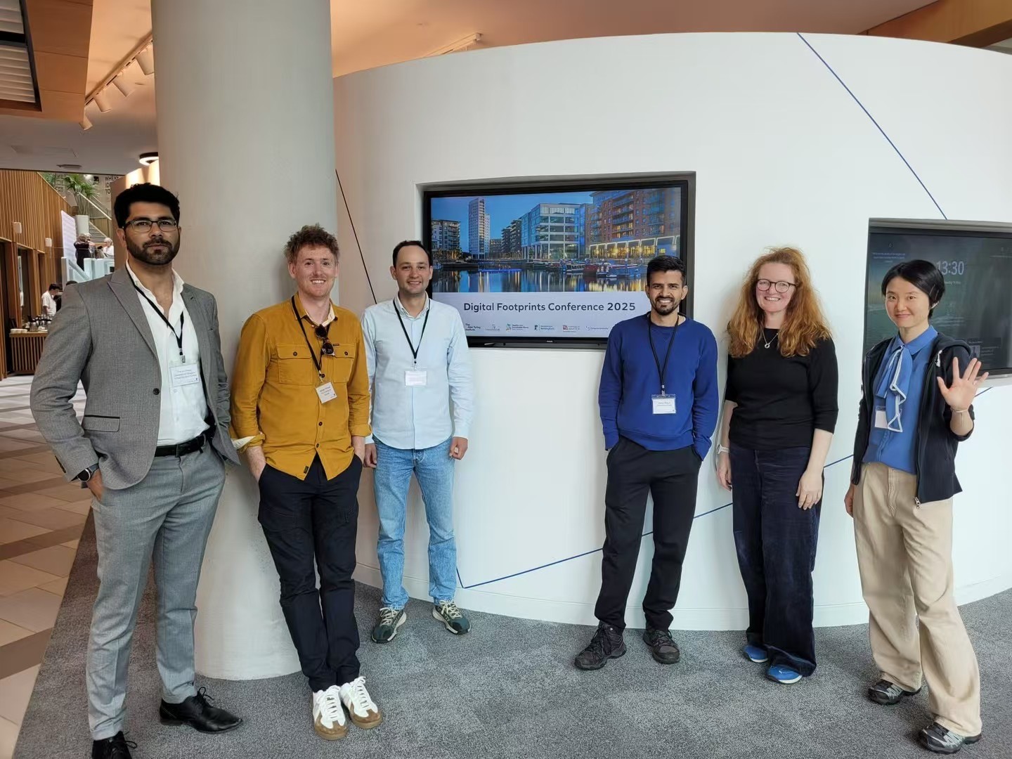
UBDC attends the 3rd Digital Footprints Conference in Leeds
This year focused on Digital Footprints for the Public Good exploring the exciting potential of novel data sources to drive impactful research.
.svg)
Join the Hub
Access the latest updates from UBDC and the university's wider social science community at the Glasgow Social Sciences Hub.
Jointly funded by


